Midjourney v8.2

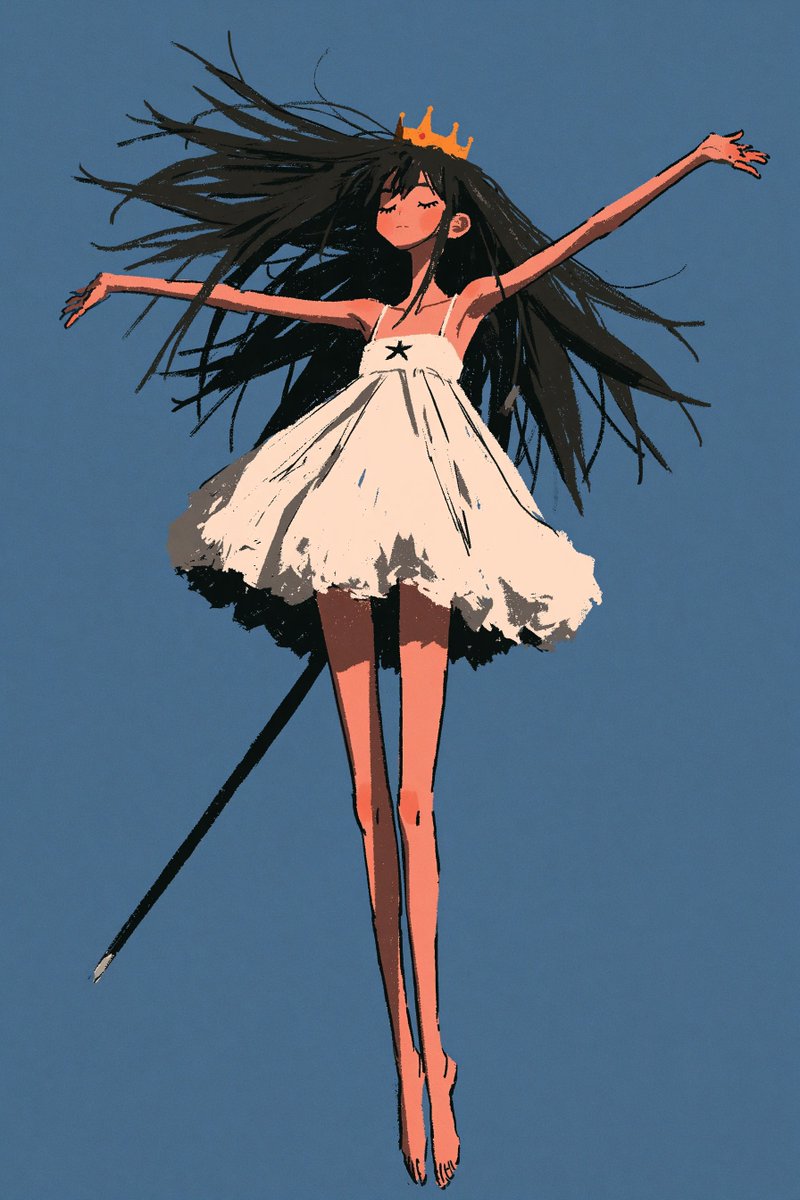
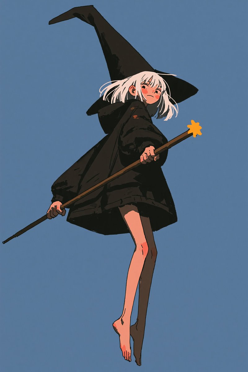
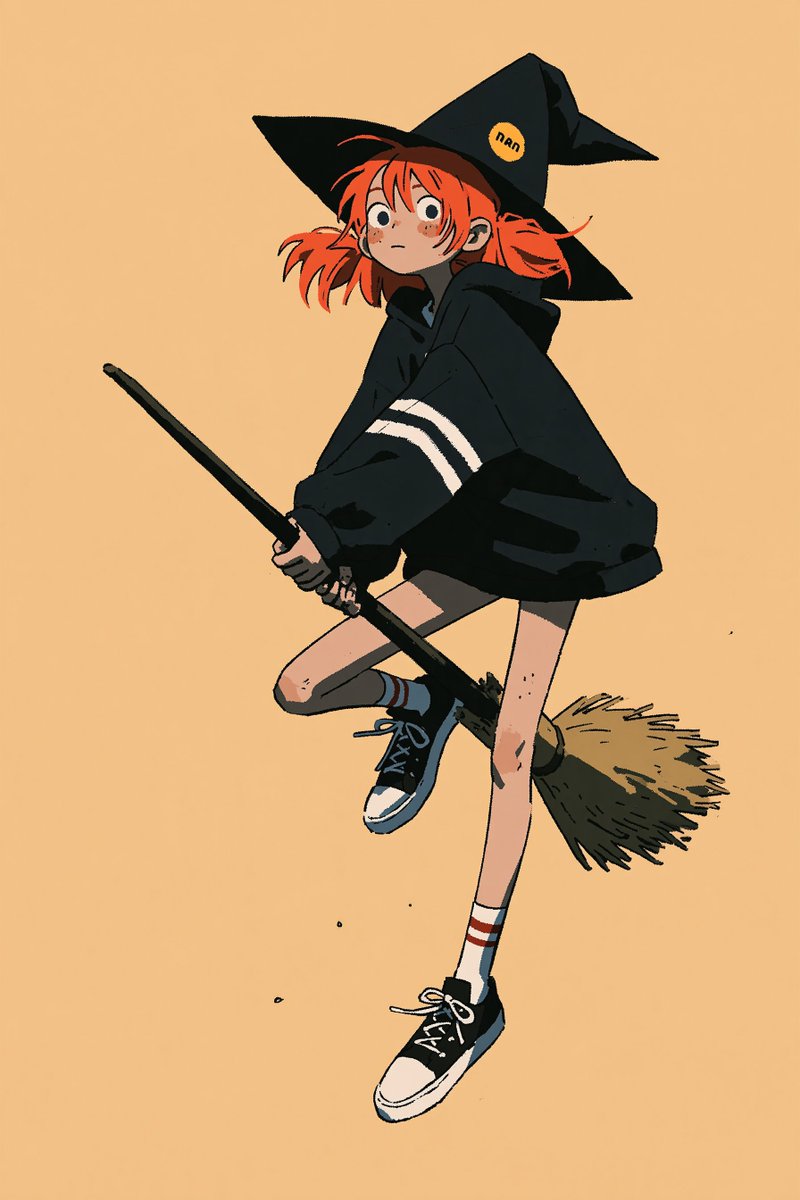
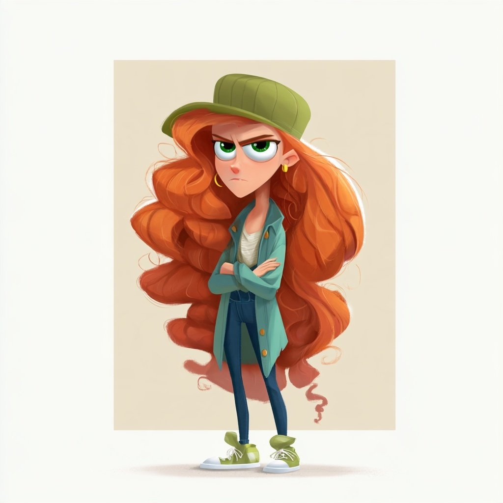
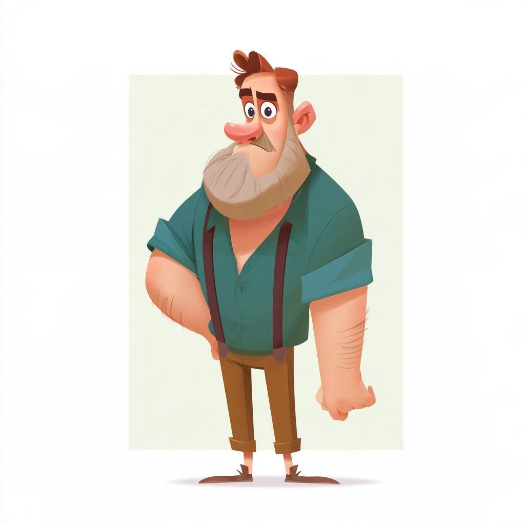
Style mix and prompt for these characters.

[your character definition], full body character design, mid-air action pose, angular painterly character concept art, bold silhouette design, exaggerated elongated proportions, anime character styling, shape-driven design, faceted planar shading, clean polished rendering, refined brushwork, crisp edges, sharp geometric forms, stylized anatomy, long legs, full light background, high contrast value grouping, high contrast highlights, polished modern character design --ar 2:3 --sref 1455092819 836332049 2116795492 71912650 4107378996 --profile kxxcnp9 oqw5d6p --stylize 1000
I came up with this new cartoon style in Midjourney today, and I’m already dying to see it in motion.

I have a feeling it’s going to look amazing once animated, and I won’t be waiting long to find out.

I’ll be sharing the style with my subscribers soon, so they can play with it too.

What do you think? Do you like this one?
Use the uploaded photograph as the sole source for all people, animals, objects, clothing, accessories, poses, expressions, interactions, camera angle, framing, and subject arrangement.

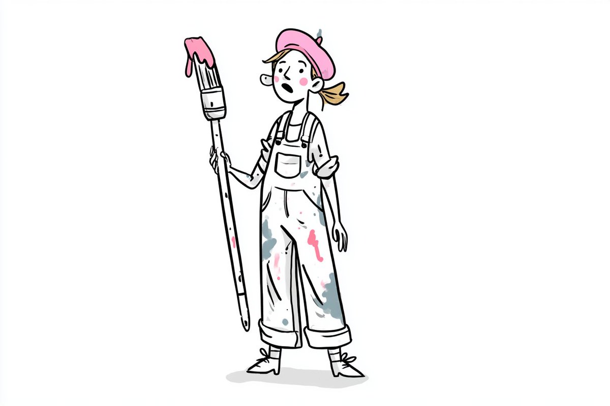
Transform the photograph into one standalone hand-drawn lifestyle poster illustration on warm off-white textured paper. Output only the completed illustration—not the original photograph, not a top-and-bottom comparison, not a before-and-after layout, not a split screen, and not a collage.

Preserve the source image’s number of main subjects, recognizable identities, relative positions, overlaps, viewing direction, pose, gesture, expression, body language, shot type, perspective, and overall composition. Preserve important props and interactions such as flowers, bags, sunglasses, hats, cameras, drinks, food, benches, raised hands, linked shoulders, or selfie gestures. Remove only background details that do not help explain the scene.

Draw every subject with energetic, imperfect black oil-pastel, wax-crayon, charcoal, and dry-ink marks. Use bold broken outlines, scratchy repeated strokes, uneven pressure, dry gaps, rough cross-hatching, scattered speckles, loose construction lines, and occasional overshooting contours. The lines must look spontaneous and handmade rather than clean, precise, or digitally traced.

Maintain recognizable faces through a small number of expressive marks. Preserve approximate face shape, hairstyle, glasses, facial hair, eye direction, mouth shape, and expression category. Simplify facial anatomy but do not replace different people with identical generic faces. Happy faces should retain their smiles; surprised or playful expressions should remain clearly readable.

For animals, preserve species, facial expression, ear shape, muzzle or beak, coat markings, accessories, and relative placement. Keep humorous gestures and group relationships intact.

Use black linework as the dominant visual language. Apply selective colored-crayon fills only to the most important clothing, accessories, props, and identity-defining areas. Derive these colors from the source photograph. Use loose, visibly scribbled coloring with paper showing through between strokes.

Limit the accent palette to approximately three to five vivid colors chosen from the source, such as cobalt blue, bright yellow, hot pink, orange, green, turquoise, red, or purple. Do not color every surface. Leave skin, most background areas, and many secondary objects primarily paper white with sparse black marks.

Simplify the environment into a few expressive grounding strokes and iconic doodles. Remove photographic scenery, realistic depth, complex architecture, and unnecessary clutter unless an environmental object is essential to the action. Preserve important scene objects in simplified outline form. For overhead group scenes, retain the recognizable arrangement of people, food, cards, blankets, cameras, and other meaningful items.

Add a small number of cheerful hand-drawn decorative marks in open areas: a rough yellow crayon sun, simple black cloud outlines, short motion strokes, hearts, emphasis rays, or tiny grass marks. Use only decorations that support the mood and do not cover faces or important objects. Do not add every decorative symbol at once.

Create an informal editorial-poster composition with the subjects occupying the central and lower portion of the page. Reserve some negative space around them for one large handwritten headline and two or three much smaller handwritten notes. Integrate the lettering naturally into the drawing without placing it inside rigid boxes.

Typography module:
Use only the exact wording supplied below.

Main headline:
[MAIN HEADLINE]

Small note 1:
[SMALL NOTE 1]

Small note 2:
[SMALL NOTE 2]

Optional small note 3:
[SMALL NOTE 3]

Render the main headline as oversized handmade black brush lettering with irregular baselines, thick dry strokes, uneven spacing, and one loose underline. Render the smaller notes as casual thin handwritten lettering with short underlines or simple emphasis marks. Keep all wording readable and secondary to the subjects.

If no exact wording is supplied, omit all typography. Never invent quotes, slogans, names, credits, signatures, or branding.

Use a warm cream sketchbook-paper background with subtle fibers, faint grain, slight tonal variation, and no hard border. The result should feel like a joyful page torn from an independent fashion sketchbook or handmade lifestyle zine: spontaneous, optimistic, tactile, slightly messy, fashionable, humorous, and emotionally faithful to the original photograph.

The final image must read first as a bold handmade black-and-color crayon illustration, and second as the recognizable people, animals, pose, and moment from the source.

Avoid: retaining any part of the original photograph, comparison layouts, split screens, photorealism, smooth digital painting, clean vector art, uniform outlines, precise technical drawing, polished comic-book inking, watercolor washes, soft airbrush gradients, full-color realistic backgrounds, anime, manga, chibi proportions, generic replacement faces, changed subject count, changed pose, missing accessories, invented people, duplicated subjects, extra limbs, malformed hands, unreadable generated text, fake signatures, logos, or watermarks.
① Open Gemini, Grok or GPT Image 2.0
② Upload your image
③ Paste the prompt
④ Generate your image and video

Prompt given below ⤵️ https://t.co/2CZSR3kSkf
How to get ChatGPT to reverse-engineer the style of an image you find online..

the process is stupidly simple:

step 1. upload your reference image to ChatGPT.

step 2. paste this prompt:

“extract this image’s visual style as reusable JSON: colors, lighting, typography, composition, textures and effects. identify the 3 defining traits to preserve. leave out the subject, logos and wording.”

step 3. save the JSON as your style profile.

step 4. attach it whenever you want that look and ask:

“create an image of [your idea] using this style profile.”

step 5. upload the result alongside your reference and ask:

“compare the styles of these two images. identify the 3 biggest differences and rewrite my generation prompt to bring the style closer to the reference while keeping my new subject.”

the hardest part is finding an image you like.
He encontrado una web con más de 10.000 prompts para generar imágenes con Nano Banana, GPT Image 2 y otros modelos.

Están organizados por estilos, fotografía, branding y mucho más.

Lo mejor es que puedes utilizarlos gratis y adaptarlos fácilmente a tus propios proyectos.

Te dejo el enlace en comentarios 👇
GPT image 2 prompt on chatGpt

Prompt 👇
Premium minimalist flat-vector travel poster for [CITY_NAME], 3:4 vertical format.

Design an original, sophisticated travel poster that captures the authentic visual personality of [CITY_NAME]. The composition must feel purpose-built for this city rather than following a reusable template.

CITY IDENTITY

First interpret the unique visual character of [CITY_NAME] and build the scene around these five elements:

1. A recognizable landmark, architectural feature, or skyline element.
2. A distinctive local way of moving through the city.
3. One subtle everyday lifestyle moment.
4. A native plant, landscape, or environmental characteristic.
5. A composition and viewpoint that naturally belongs to the city.

The overall scene structure must change from city to city. Do not repeatedly use the same object positions or visual formula.

Possible compositions include:
harbor viewpoint, narrow historic lane, riverside garden, coastal path, elevated city overlook, lively market passage, tram avenue, ferry terminal, botanical setting, heritage square, beach promenade, cultural plaza, or skyline terrace.

Choose whichever composition best represents [CITY_NAME].

TYPOGRAPHY

Place “[CITY_NAME]” in the upper-left area with generous clean negative space.

Add one short, sophisticated English tagline inspired by the atmosphere of the city.

Typography should feel understated, editorial, spacious, and premium. Never allow text to dominate the artwork.

VISUAL HIERARCHY

Use one iconic landmark or architectural feature as the main focal point.

Support it with only 2–4 carefully selected local elements. Every added detail should strengthen the sense of place.

Avoid landmark collections or postcard-style collages. Keep the scene visually quiet and intentional.

PEOPLE

Include only 3–6 small-scale figures.

Give each person a believable activity connected to local life, such as:
walking through a historic lane, cycling, waiting for public transport, sketching architecture, boarding a ferry, reading outdoors, taking a quiet photograph, carrying beach equipment, browsing a market, or jogging beside the water.

Avoid crowds and avoid making any single person the main character. Figures should integrate naturally into the environment.

LOCAL CHARACTER

Use city-specific elements only when they genuinely fit [CITY_NAME]:

- local transportation
- architecture
- street furniture
- vegetation
- small signs or wayfinding
- local food references
- recreational activities
- pavement markings
- cultural details

Transport and signage should remain subtle. Instead of always using a large signboard, incorporate details naturally through a small transit marker, station clock, ferry information panel, bike symbol, painted road marking, beach flag, or understated metro icon.

ART DIRECTION

Japanese stationery-inspired aesthetic,
luxury sticker illustration,
premium commercial vector artwork,
modern editorial travel branding,
clean delicate outlines,
uniform line weight,
simple geometric forms,
flat-color illustration,
soft shapes,
balanced visual rhythm,
high-end minimalist postcard design.

COLOR SYSTEM

Build the atmosphere primarily with:
pale powder blue, soft sky blue, mist blue, and cool airy blues.

Balance these with:
warm ivory, cream, soft beige, muted sage, gray-green, and understated architectural neutrals.

Use dusty rose or muted blush only for tiny visual accents such as flowers, clothing details, small signs, awnings, or decorative objects.

Colors should remain soft, sophisticated, slightly desaturated, and cohesive.

MOOD

Fresh, airy, peaceful, refined, contemporary, elegant.

The final artwork should feel like a premium boutique travel postcard or luxury lifestyle brand illustration, with generous breathing room and a relaxed sense of place.

IMPORTANT QUALITY RULES

Every city must have its own visual identity.
Change the camera angle, scene structure, landmark placement, foreground treatment, and supporting details according to the city's character.

Do not simply replace [CITY_NAME] inside an existing composition.

NEGATIVE PROMPT

No photorealism.
No realism.
No watercolor.
No painterly brushwork.
No gradients.
No heavy shadows.
No dramatic cinematic lighting.
No paper texture.
No excessive detail.
No cluttered background.
No landmark collage.
No crowded streets.
No oversized characters.
No dominant hero character.
No repetitive café composition.
No fixed signboard position.
No identical foreground treatment.
No generic tourist-poster formula.
No copied layout from another city.
No unnecessary decorative elements.